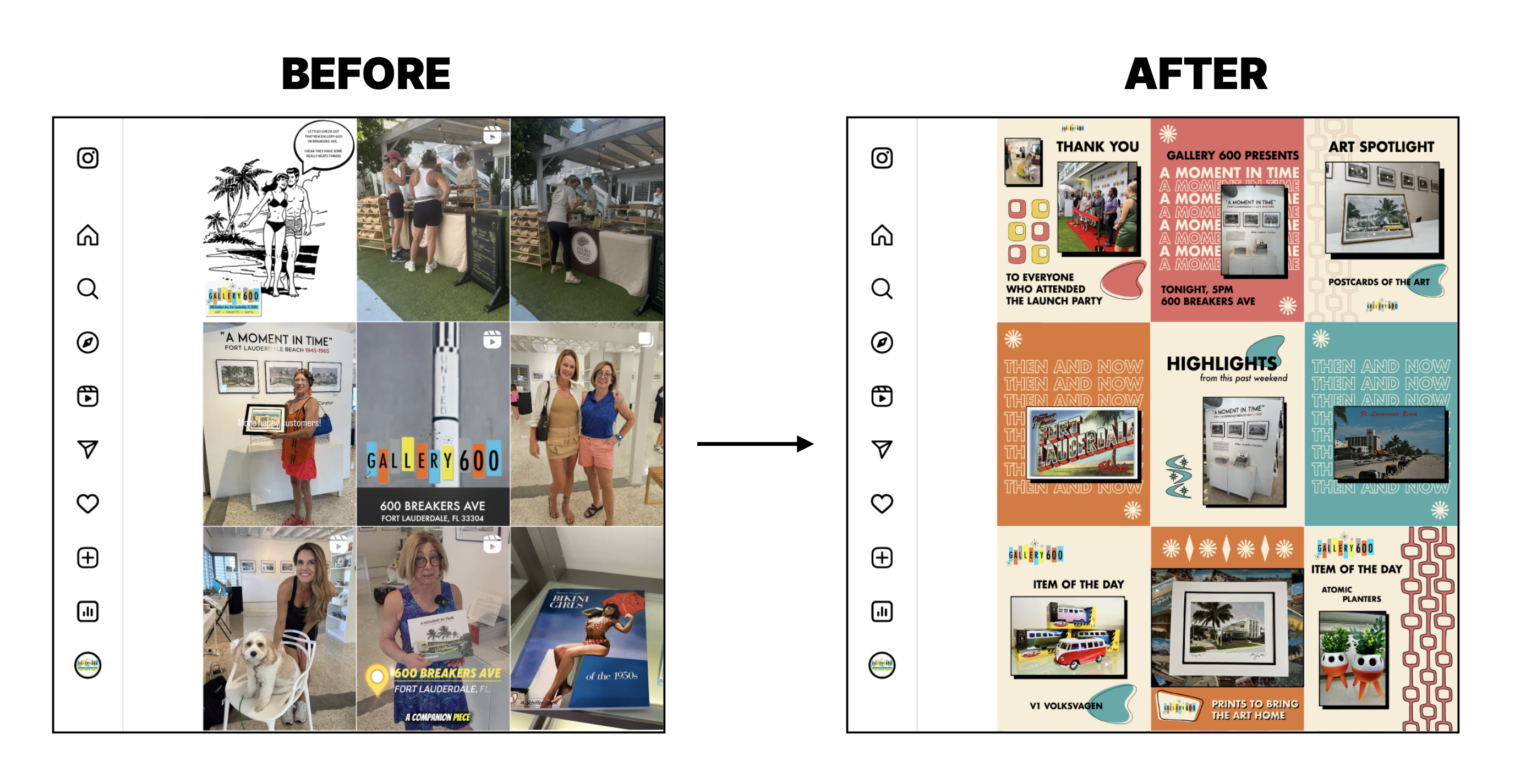
Before/after of social media grid for art gallery.
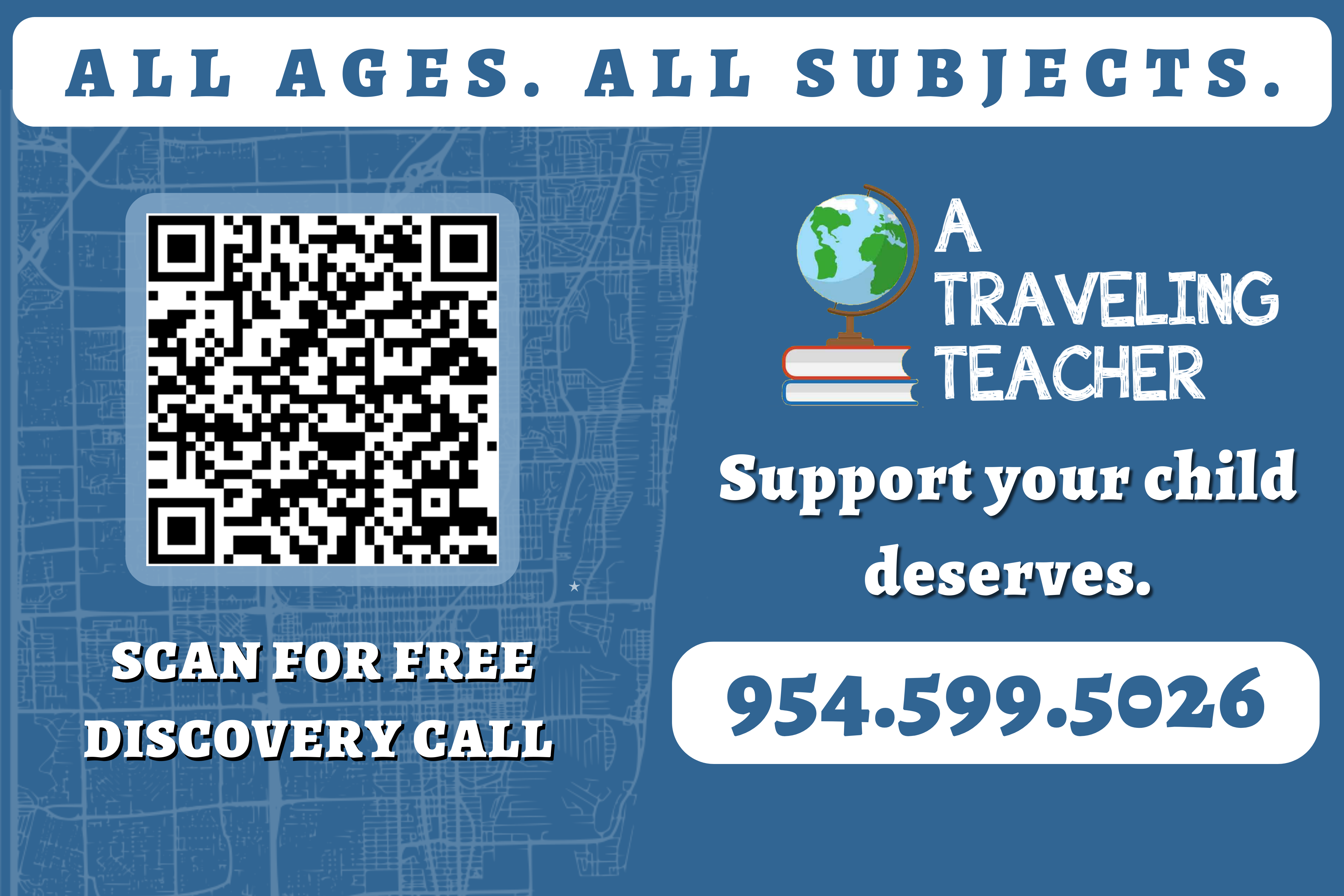
Banner design for tutoring company.
Featured Projects
Rebrand
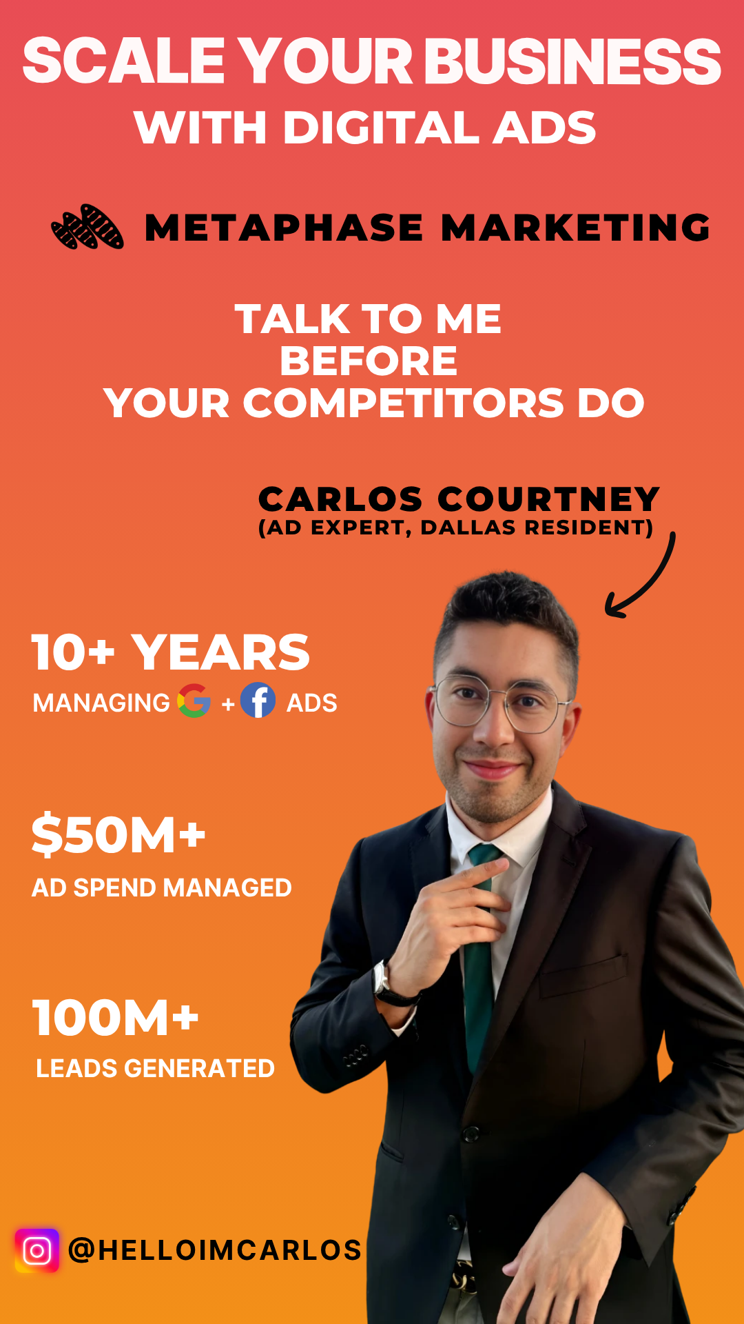
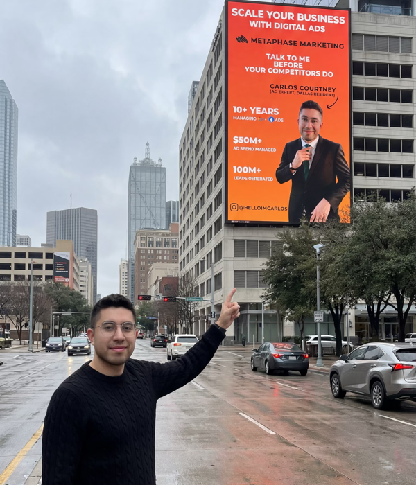
Metaphase Marketing
Carlos built Metaphase Marketing into one of Dallas's sharpest digital ad agencies. But his brand still looked like day one. He needed a visual identity that matched where the business actually was, not where it started.
The challenge was honoring what already mattered. The name "Metaphase" comes from Carlos's background in biology, and the original mark reflected that. We kept the DNA thread but rebuilt it from scratch. Cleaner geometry. Fewer strokes. A mark that reads at billboard scale and favicon scale alike.
For color, we pulled from Phoenix, where Carlos grew up. Warm, grounded tones that feel personal without feeling regional. The palette gave his brand a warmth that most marketing agencies avoid, which is exactly what makes it memorable.
The identity rolled out across digital, social, and a billboard campaign throughout Dallas.
New Brand
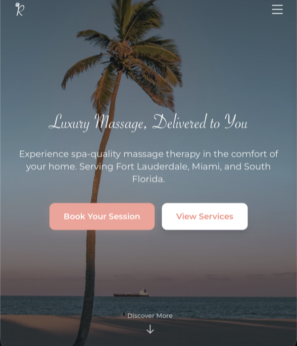
Rosewood Touch
Erica has been a licensed massage therapist for over a decade. But for most of that time, she was working under other companies and platforms that took a cut of everything she earned. She was ready to build something of her own. She just didn't have the brand to do it.
We started from nothing. No name, no logo, no visual identity. We developed the name Rosewood Touch to reflect the warmth and natural essence that Erica brings to her practice. The logo is a single, elegant lettermark. The palette is soft and grounded — blush, cream, muted coral — without falling into the cliche spa aesthetic that makes every massage therapist look interchangeable.
From there, we designed and built her website and created a social media system that gives her a consistent, professional presence across platforms. Erica went from splitting her income with middlemen to running her own brand in Fort Lauderdale. With the ability to take clients directly, she increased her margins by 30%.
Rebrand
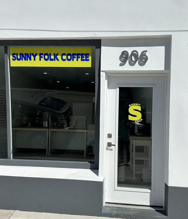
Sunnyfolk
Alexander had been running Boathouse Bakery for a while, but the name never quite fit the experience he was building. When we met, he was circling the idea of "Sunnyfolk" but hadn't committed. He needed someone to help him see whether it could carry a brand.
We built it out. The branding confirmed what he already felt — Sunnyfolk was the right move. It captured something Boathouse Bakery never could. A name and identity that felt native to Fort Lauderdale, the kind of coffee shop that belongs in the Sunshine State rather than just existing in it.
The rebrand gave Alexander more than a new look. It gave him clarity. Sunnyfolk is now growing into one of Fort Lauderdale's most popular coffee shops, with a brand that finally matches the foot traffic walking through the door.
Ready to build something?
If your brand needs work, let's talk about what that looks like.